Tuesday, 24 May 2016

NEW
Fiio M3 Review

HIGHLIGHTS

  • The Fiio M3 is priced at Rs. 4,499.
  • It can be used to play various high-resolution and lossy file formats.
  • The sound is neutral and highlights the headphones you use.

Fiio has been one of the biggest proponents of high-resolution audio, and its range of audio players has enjoyed success the world over. Available at various price points, the Fiio X-series offers varying levels of sonic performance. The Fiio X1X3X5 and X7 have all received praise from us.
This is why we're looking forward to reviewing Fiio's most affordable model yet, the M3. Priced at Rs. 4,499, the M3 appears to offer a lot for your money, with support for high-resolution audio formats and up to 72GB of total storage. Find out if the M3 offers enough bang for your buck.


Look and feelThe biggest difference between the Fiio M3 and Rs. 7,499 X1 is size. The M3 is significantly smaller and lighter than the X1, which makes it easier to carry and store. Another key difference is the use of plastic as the primary construction material, which is part of the reason why the M3 weighs just 40g. It's also available in four colours: black, white, blue and cyan.
The device has a brick-like shape, with sharp edges and buttons that sit flush with the device itself. The left side has the power button and the right has the lock slider, while the bottom has the Micro-USB port for charging and data transfers, the 3.5mm socket, and the microSD card slot. The physical navigation buttons are placed right below the screen. On the whole it's a conveniently small and lightweight package that is easy to get used to.
The Fiio M3 also comes with its own earphones, but these don't offer much sonic isolation and are average as far as sound is concerned. We'd recommend you switch to a good pair of aftermarket earphones for the best performance. There's also a standard Micro-USB cable included in the box for charging and data transfers.


Specifications and softwareThe device has 8GB of internal storage, which is notable because the X1 has none, forcing you to invest in a microSD card from the start itself. The M3 does have a microSD card slot that supports cards of up to 64GB, which allows you to have up to a maximum of 72GB of storage space on the device. There's a 550mAh battery which powers the device for up to a claimed 24 hours, thanks to a low-power Cirrus Logic CS42L51 DAC. 

Fiio M3 Review

Read More

Lenovo Zuk Z1 Review

HIGHLIGHTS

  • The Lenovo Zuk Z1 is priced at Rs. 13,499.
  • The phone runs Cyanogen OS 12.1, based on Android 5.1.1.
  • It's powered by the Qualcomm Snapdragon 801 SoC with 3GB of RAM.

The Lenovo Group already has two solid and instantly recognisable brand names in its stable: Lenovo itself, and Motorola. As a result, the company has a variety of solid products that sell in huge numbers the world over. However, like others have done before, Lenovo has decided to market a part of its product range as online-only. These products come under the new Zuk sub-brand.
Today, we're reviewing the Lenovo Zuk Z1. Although marketed globally as the Zuk Z1, Lenovo has chosen to retain its parent name in brand-conscious India in order to make it immediately clear what the heritage of the device is. However, it's also important to remember that the Zuk Z1 was first launched globally in September last year, so what we're reviewing today is a bit dated already. Let's go into the details in our review.
lenovo_zuk_z1_main2_ndtv.jpg
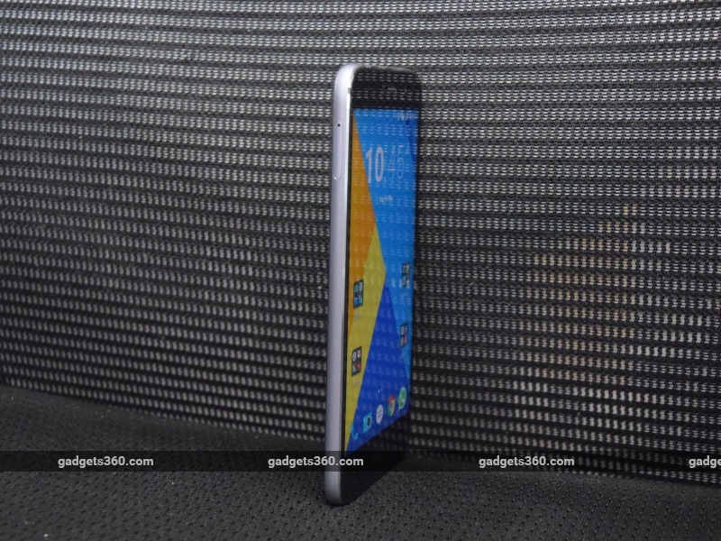
Look and feelOnly a few years ago, phones with 5.5-inch screens were considered oversized, and it was often a topic of discussion if you had a large phone. Today, this size has become the norm because of increased media consumption on smartphones. The Lenovo Zuk Z1 goes with this tried and tested size, although the phone does definitely feel a bit bulky.
The reasons for the bulk are a metal frame and a 4100mAh battery, which contribute to the phone's 175g weight. Although it does not have a unibody casing and the back is plastic, the battery is not user-accessible. The dual-SIM tray is on the left side, within the frame. The phone does not support expandable storage, so there is no slot for a microSD card.
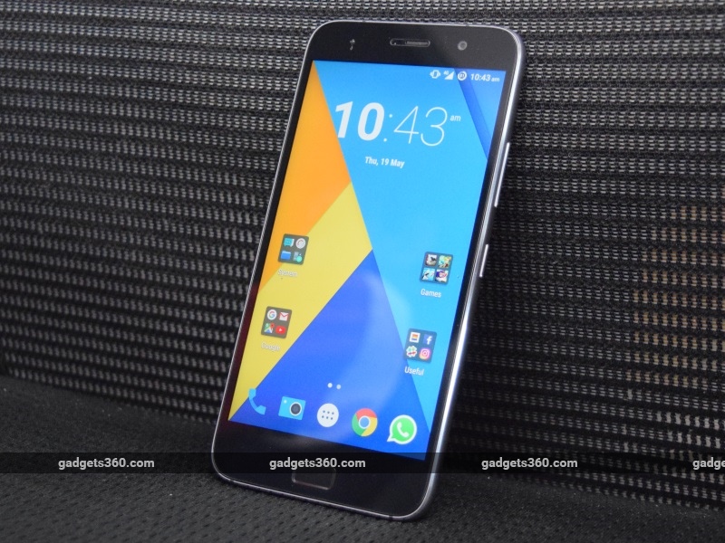
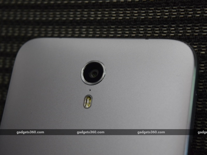
There are two colour options for the Lenovo Zuk Z1 in India; white and space grey. Our review unit was grey, which we quite preferred over the white option. The back has a dull, metallic finish, as does the frame. The phone is bare of any Lenovo branding, with just a Zuk logo at the back and nothing else. The camera and flash are located at the centre of the back near the top, and on the whole we quite like the minimalist styling of this phone.
lenovo_zuk_z1_back_ndtv.jpg
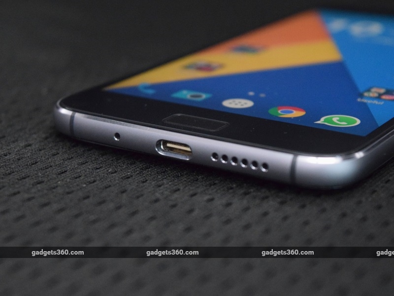
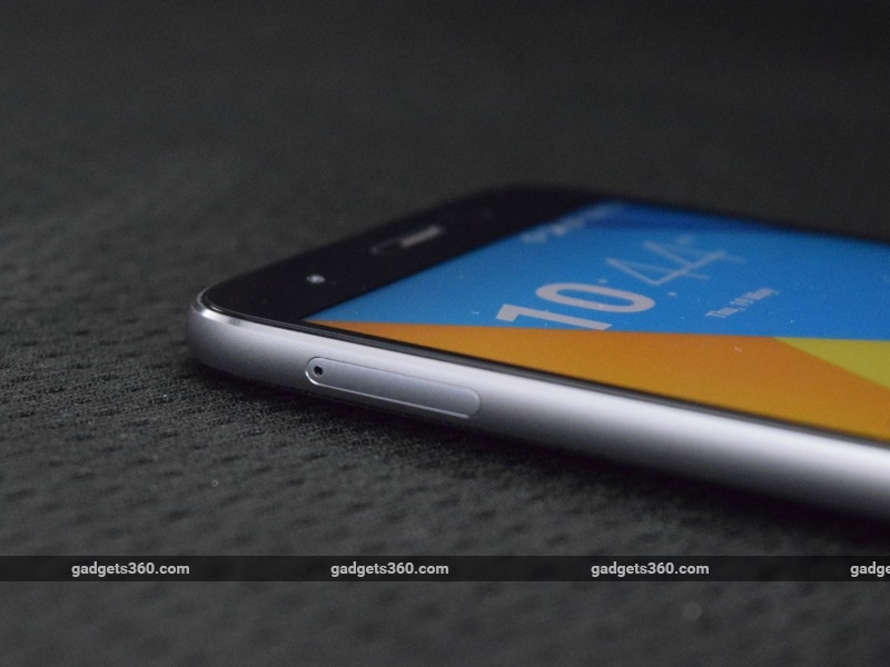
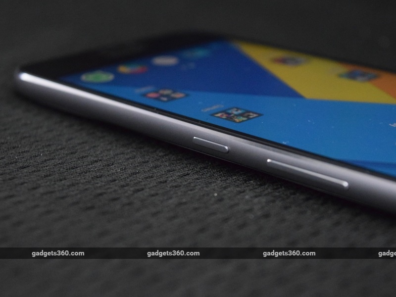
The bottom has the microphone, speaker, and USB Type-C port for charging and data transfers. Also included in the box are a 13W power adapter and a USB 3.0 cable with a Type-A plug at one end and Type-C at the other. The right side of the phone has the power and volume buttons, while the top has the 3.5mm socket. The screen occupies nearly 70 percent of the front of the phone, while the camera, earpiece and proximity sensor sit above it. At the bottom is the physical home button with its integrated fingerprint sensor, and capacitive Android navigation keys.
We have seen plenty of good implementations of home buttons with a fingerprint sensors built in, including the Samsung Galaxy A8 (Review) and HTC One A9 (Review). Many of them allow you to unlock the phone by simply touching the sensor even while in standby mode, but the Zuk Z1 does not. You have to wake the phone by pressing the home button down and then maintaining contact till your fingerprint is recognised, or hitting the power button first. 
lenovo_zuk_z1_fingerprint_ndtv.jpg
This isn't itself a problem, but the button is slightly recessed and a bit firm, needing some effort to press down. The sensor itself is quick and accurate in unlocking the phone, but the process isn't quite as easy as it is with other devices. The sensor previously worked as a capacitive back button as well, but this has now been disabled by a software update.
The screen of the Lenovo Zuk Z1 sports a resolution of 1080x1920, with a density of 401ppi. It's a decent screen, and is sharp enough to serve most of your requirements. Brightness isn't quite as great as we'd have expected from an IPS-LCD screen, and even at its brightest it doesn't quite seem as bright as it should be. However, a polarising coating on the screen does help with legibility under bright sunlight, so it doesn't need to be too bright. It is best to control brightness manually, as the adaptive brightness mode usually makes it too dull. Black levels are decent as well, as is the contrast ratio which ensures a fairly accurate representation of colours through the spectrum.
Additionally, there is also LiveDisplay, a setting that allows you to optimise the colour tone of the screen based on the time of day. You can choose how cool or warm you want the colours to get based on the time of day, or set the colour temperatures manually. This lets you set up the IPS-LCD screen exactly as you want it. The temperature switches made a noticeable difference to viewing comfort, and the ability to adjust this at any time is a great addition to the phone.
lenovo_zuk_z1_usbc_ndtv.jpg

Specifications
At a time when new smartphones priced at under Rs. 15,000 are running the latest MediaTek Helio or Snapdragon 600 series SoCs, the Lenovo Zuk Z1 packs in the higher-end but older 32-bit quad-core Qualcomm Snapdragon 801, clocked at 2.5GHz. It's been about two years since the first Snapdragon 801 smartphones hit the market, so Lenovo's choice of SoC will raise a few eyebrows, particularly because it's a 32-bit SoC when practically all hardware is now geared for newer 64-bit processors. 
Apart from the fact that the phone was first launched the better part of a year ago, an explanation offered by Lenovo for this is that the Cyanogen team knows the Snapdragon 801 really well, and using a different SoC at this point would send all its software optimisation efforts for a toss. However, you're still buying a phone with an old SoC, and this is cause for concern about the longevity of the Zuk Z1. That said, the phone does run the latest and most stable variant of the Snapdragon 801, the MSM8974AC, and has the excellent Adreno 330 GPU. It's an extremely capable SoC even today, continuing to perform with the same consistency and strength as when it was new. 
The Zuk Z1 also has 3GB of RAM, 4G connectivity on its two SIM slots (Indian bands supported), Wi-Fi ac connectivity, and a 4,100mAh battery. The phone has a significant internal storage capacity of 64GB as well, but there's no support for expandable storage so you're limited to that much.
lenovo_zuk_z1_simtray_ndtv.jpg
Software
The phone runs on Cyanogen OS 12.1, which is based on Android 5.1.1. Although there has been talk of a planned upgrade to Cyanogen OS 13 based on Android 6.0, this update isn't available through the phone's OTA software update system yet. While Cyanogen OS isn't quite as tweakable as the geek-inspired CyanogenMod, it offers a decent blend of customisability and stability.
In most ways, Cyanogen OS functions just like stock Android, and you can even change the theme to have it look like that. The system's trademark is its high degree of customisability, and we see a lot of this in Lenovo Zuk Z1. The home screens and app drawer can be changed to different layouts, the grid sizes, scroll effects and icon labels can be changed and toggled, and there's much more to play with. You get a fair amount of control over how the user interface looks at its most basic level.
lenovo_zuk_z1_main_ndtv.jpg
Going further in, the Settings app also has a few different options that give you a greater sense of control over the device than most standard manufacturer UIs offer. This includes being able to control whether the screen should light up when you plug in a charger, the colour of the notification light for battery alerts, custom actions for the home and recent buttons, the position of various elements on the status bar and notification drawer, and much more. Cyanogen OS is the ideal operating system for advanced users who want control over more aspects of their phones, and one we love using because of its general stability, light footprint and ease of use. Additionally, it's free of any bloatware and has a good set of system apps that are well designed and light on phone resources.
lenovo_zuk_z1_cam_ndtv.jpg
Camera
The Lenovo Zuk Z1 has a 13-megapixel primary camera built on Sony's IMX 214 sensor, and also features optical image stabilisation and a dual-LED flash. The front camera sports an 8-megapixel sensor, and both cameras can record video at up to 1080p, with the rear camera also featuring 60fps video recording.
The camera app is Cyanogen's own Camera Next, which is a fairly decent option in terms of ease of use and functionality. Most useful toggles are easily accessible from the viewfinder screen itself, including flash, camera and timer settings. Video recording is a one-step procedure, and panorama mode can also be quickly toggled this way. Additionally, resolution settings, manual controls and codec selection can be done through the settings menu, which gives you an atypically large amount of control over your pictures and videos.
lenovo_zuk_z1_camerashot3_ndtv.jpg
(Tap to see full-size image)
The camera itself is fairly capable, taking pictures that are sharp and detailed, and manage to capture colour tones effectively and accurately. In well-lit images, the handling of light and dark areas is particularly good, while low-light images succeed in capturing a fair amount of detail with an acceptably low amount of noise and grain. Indoor shots aren't quite as good as well-lit outdoor shots, but are up to an acceptable standard as far as detail and colours go.
Videos are fairly good in decent light, but suffer a bit in low-light conditions. However, the ability of the camera to focus quickly and readjust to lighting conditions is commendable, and far better than other devices we've seen in this price range. High-speed and slow-motion modes produce fun results with a clean sense of motion and fluidity.
lenovo_zuk_z1_camerashot1_ndtv.jpglenovo_zuk_z1_camerashot2_ndtv.jpg
(Tap to see full-size images)
Performance
Despite its two-year-old SoC, the Lenovo Zuk Z1 is a capable performer that outdoes a lot of newer options from both Qualcomm and MediaTek. However, you are likely to get better performance from the new Qualcomm Snapdragon 650 and 652 SoCs which are found on some similarly priced devices. It's also important to remember that the Adreno 330 GPU is too old to support OpenGL ES 3.1 and 3.2, so this may affect the phone's ability to play some newer, more graphics-intensive games.
General performance on the phone, as well as with the games we tried (Marvel: Contest of Champions, Trials: Frontier and Uncharted: Fortune Hunter) was excellent, with no significant heating issues and absolutely no lag or stutter. This can also be credited to Cyanogen OS, which ensures that the Zuk Z1 always runs smoothly thanks to its low impact and optimal utilisation of the device's resources.
lenovo_zuk_z1_buttons_ndtv.jpg
Our suite of benchmark tests corroborated all of this, with impressive scores through the tests, particularly with the graphics benchmarks. AnTuTu and Quadrant produced scores of 57,835 and 24,885 respectively, while GFXBench and 3D Mark Ice Storm Unlimited returned scores of 28fps and 19,550. All of these are excellent, particularly when you consider the age of the Snapdragon 801 SoC, and are an indication of just how capable and ahead of its time the SoC was back in 2014.
The Zuk Z1 ran for 13 hours, 40 minutes in our video loop test, which is an impressive figure. In ordinary day-to-day use, the phone would last us well over a day on a full charge, despite continuous 4G connectivity, a bit of gaming and the screen brightness set at the highest level throughout. Wi-Fi, cellular connectivity and call quality are excellent as well, and the only drawback is the somewhat weak speaker that sounds poor. However, with headphones, the sound quality is decent enough to use the phone as your primary music player and for watching the occasional video.
lenovo_zuk_z1_side_ndtv.jpg
VerdictLenovo has an excellent device on its hands with the Zuk Z1. The phone is well built, runs excellent software, has a good display, comes with plenty of storage, and has excellent connectivity and good battery life as well. There's also a great screen which is sharp and can be tweaked and customised to your preferences. Above all, the company has achieved all of this at a great price that will tempt a lot of buyers, particularly advanced users who know a thing or two about the advantages of Cyanogen OS over other manufacturer-developed user interfaces.
Unfortunately, there are some noteworthy drawbacks as well. Although we faced no performance or compatibility issues during our time with the phone, it does run an old 32-bit SoC with a GPU that may have trouble with new games and apps going forward. There's also the previous version of Cyanogen OS and Android out-of-the-box, with no timeline on an update to the newest software. Although a relatively minor complaint given the ample 64GB of on-board storage, the phone does not support expandable storage. And finally, buying the Z1 won't be easy because of the annoying flash sale model.
However, the Lenovo Zuk Z1 is a great option nonetheless, particularly considering its price and the features on offer. If you don't expect the age of the hardware to be a problem for you over the next couple of years or plan to use this as a secondary smartphone, the Zuk Z1 may well be worth considering over some of the other options in this price range.

review Lenovo Zuk Z1

Read More

We have used the PlayStation 4 controller many times before: at E3, Gamescom, and other preview events. But never for more than about 15 minutes at a time, which is nowhere near long enough to to get a real feel for how the controller handles in a normal gaming environment.
But recently we were offered the chance to review Assassin’s Creed IV: Black Flag several weeks before its release, and although we can’t talk about the game until the embargo lifts we can discuss the fact that we were playing it on a retail PlayStation 4.
There’s been some minor controversy that in many cases, such as at the recent Eurogamer Expo event in London, Sony has been using PCs to demo their PlayStation 4 games and not real consoles. This is actually very common in the industry, before a new console is released, but it is embarrassing when they crash and suddenly there are Windows error messages everywhere.
That didn’t happen when we were playing Assassin’s Creed IV, in fact the whole experience went by completely smoothly, with no crashes and not even any obvious bugs in the game. That may seem like small reason to celebrate but these were new consoles hot off the assembly line and we, and the eight or so other journos, had them running the same game for 17 hours straight, two days in a row.
Beyond that though there’s relatively little we can tell you about the console itself. It wasn’t online so although we were free to fiddle with the dashboard there wasn’t much for it to do. The XMB interface of the PlayStation 3 is no longer being used but the replacement doesn’t seem too different, with a horizontal line of five major options: What’s New, Game, Live from PS, Internet Browser, and Downloads.
Obviously most of these only do something if the console’s online but if you push up on the controller you get a longer list of more specific options: Store, Notifications, Friends, Messages, Partners, Profile, Trophies, Settings, and Power. It’s always exciting to see a new console in the raw for the first time but in truth we didn’t really learn anything new from the experience. The controller though was a different matter…
For many people the question of the PlayStation 4’s controller is the most important factor in deciding whether or not to get the new console or opt for the Xbox One. After all a console’s line-up of games can be improved at any time but it’s much harder, and much riskier, to change the controller design. Many complain that the current DualShock 3 is not well suited to first person shooters, and that its design and control stick placement is outdated and in need of a complete overhaul. But as you can tell simply from looking at a photo that’s not what’s happened here.
The DualShock 4 has undergone a substantial redesign though, perhaps the most significant in its history. The most unequivocal improvement is to the left and right triggers at the back, which are longer and more contoured – so that your fingers sit on them much more comfortably and with no danger of sliding off.
The touch pad on the front also seems a very positive change at this point. Although pressing it in like a physical button is a bit springy it’s useful to have such a large non-action button in easy reach. It was used to access a map in Assassin’s Creed IV, and once activated you could pinch and zoom the view via the touch pad – just as you would with any touchscreen device.
The Share and Options button either side of the touchpad are simply renamed Start and Select buttons, but we still would’ve preferred if they were a little bigger and easier to press in a hurry. The Options button was used to access the main menu in Assassin’s Creed and we suspect it will be put to similar use in most other games.


DualShock 4 – whose bright idea was the light bar?

There is one very obvious flaw in the DualShock 4’s set of new features though and that’s the light bar at the back. Although it can be changed colour to indicate low batteries or in-game functions (such as low health in Killzone: Shadow Fall) Sony insist that it cannot be turned off altogether. This creates a very obvious problem in playing in a darkened room: you can see the light bar shining back on the TV.

The bar is large and extremely bright, which can be very distracting when you notice it – especially during non-interactive cut scenes. Given its negligible functionality in most games it seems bizarre that Sony won’t let you just switch it off, although hopefully they’ll see sense and the option can be patched in soon after launch.
In terms of the face buttons there was no obvious change but the controller itself is a significantly heavier device than the DualShock 3, which has been criticised as feeling too lightweight and insubstantial. The DualShock 4 feels like an immediately more substantial device, but we do have concerns about the design of the larger forward grips.
The grips are now quite chunky and budge outwards slightly in the middle, in what we found a mildly unpleasant manner. We wouldn’t go as far as to say it’s uncomfortable, but it certainly doesn’t seem as ergonomic as the Xbox 360 controller, and it seems Sony has overcompensated for those with bigger hands that have complained about the DualShock 3.
After essentially two days of non-stop play our hands (which we’d say were strictly average in size) didn’t feel sore in any way but neither did the DualShock 4 seem to melt into our hands in quite the same way the Xbox one does. That may simply be unfamiliarity though, and perhaps after further weeks and months we’ll forget it was ever an issue.
The same may also be true about the analogue sticks, but at the moment we feel they remain inferior to the Xbox. They’re certainly a lot tighter and more precise than the DualShock 3 though, with a noticeably smaller dead zone. But we’re not immediate fans of the redesigned top of the sticks, which is now slightly concave and surrounded by a thick outer ring.
Again, it’s not that they’re uncomfortable but they’re clearly trying to mimic the Xbox 360 controller and it doesn’t work quite as well given the two sticks are closer together on a DualShock. And that’s the real problem: the DualShock 4 is the best controller Sony has ever made but it’s not the complete redesign that many have been calling for.
The DualShock has been a bodge ever since the very early days when Sony saw the Nintendo 64’s controller and quickly added two analogue sticks to a design that was never originally meant to house them. No doubt Sony considers the DualShock design to be so iconic they have to keep it but we feel this is a mistake. The controller should be 100 per cent about functionality, but that never seems to be Sony’s thinking.

Instead they’re continually tinkering and improving a design that probably should have been abandoned and started again from scratch a decade ago. We haven’t yet played the Xbox One controller for as long as we have the DualShock 4, so we can’t speak too much of that, but for now we’d still say the Xbox 360 gamepad is still better than the DualShock 4 – even if there’s now less in it than before.
https://www.youtube.com/watch?v=wPeBWguyGjM

review dualshock 4

Read More

WHAT IS THE ALCATEL ONETOUCH IDOL 3?

The Alcatel OneTouch Idol 3 is the company's flagship Android phone. It's unlikely to be spoken of in the same sentence as the Samsung Galaxy S6 or the HTC One M9 for a couple of reasons. Firstly, Alcatel doesn't have the marketing pull to compete with the Apples and Samsungs of this world. Secondly, it's significantly cheaper than those top-end phones.
Alcatel has taken the unusual step to offer the Idol 3 in two sizes. We've lived with both the 4.7in (£150) and the 5.5in model (£260), but it's the bigger of the two that we'll focus on in this review. While both models share the same design philosophy, spending a little more will buy you better specs.
So can the Idol 3 compete with the very best? Well it certainly makes a great attempt, and here follow the reasons you should consider this reasonably priced Android handset.

ALCATEL ONETOUCH IDOL 3 – DESIGN 

While there's no sign of the high-grade glass or aluminium finishes you get with top-end smartphones, Alcatel has certainly done a great job at this price point of making a predominantly plastic phone look elegant.
The combination of the silver plastic edging, two-toned trim and the matte-grey back with a slightly brushed finish all contribute to making the Idol 3 eye-catching. The curved corners add a touch of sleekness to an already slim frame and the plastic feels nice to the touch. Samsung take note: this is how you make a good-looking plastic phone.
Up-front, the screen bezel is slim down the sides, while above and below the screen sit the front-facing JBL speakers. Ports and connections are well spread around the trim, with the micro 3G/4G SIM placed just below the standby button. Puling out the SIM card tray also reveals support for a micro SD card, enabling you to expand storage beyond the 16GB or 32GB depending on the model you go for. Sadly, the rear of the phone – which houses the camera and LED flash – isn't removable, so there's no getting to the 2,910mAh battery.
The Idol 3 benefits from dual microphones, as is standard on most phones nowadays, but Alcatel has gone one better here. By combining a switching screen orientation feature, you can now make or take calls no matter which way up you're holding the phone – and get the same call quality. We'll get to that in more detail later


PROS

  • Attractive plastic design
  • Some unique Android tweaks
  • Impressive sounding speakers
  • Sharp Full HD screen

CONS

  • Laggy when multitasking
  • 13-megapixel shooting not as reliable as 10-megapixel shooting

KEY FEATURES

  • 5.5-inch Full HD 1080 IPS LCD screen
  • Snapdragon 615 quad-core CPU with Adreno 405 GPU
  • 13-megapixel main camera with LED flash
  • JBL-powered front-facing speakers
  • Android 5.0 Lollipop 
  • 8-megapixel front-facing camera
  • 32GB storage with 2GB RAM
  • Manufacturer: Alcatel
  • Review Price: £260.00

ALCATEL ONETOUCH IDOL 3 – SCREEN

There's a trend for some phone manufacturers to offer higher-resolution 2K screens, but most will be satisfied with what Full HD 1080p has to offer at this size. For starters, it will have less impact on the battery life.
One of the biggest advantages of opting for the 5.5in Idol3 OVER
 the 4.7in handset is that you get a Full HD screen – and it's a great one too.
It's a fully laminated IPS LCD screen, packing in a 400ppi pixel density and a maximum brightness of more than 600 nits. That translates to a sharp, exceptionally bright screen with strong viewing angles. Alacatel has partnered with Technicolor to introduce what it's calling "Color Enhance technology". This essentially takes advantage of the Idol 3's adaptive screen to improve contrast and colour rendering for more vivid colours.
While we wouldn't say it's as punchy or as impressionable as Samsung's AMOLED screens, this is still a fantastic display for the price.


ALCATEL ONETOUCH IDOL 3 – CAMERA

The ability to take better pictures has been a prime concern for Alcatel with its new flagship, so it's made improvements to the hardware and the software to ensure it's an all-round performer. The rear camera benefits from a 13-megapixel Sony IMX214 sensor with an LED flash and a 2.0 aperture lens to aid low-light shooting. Up-front is a sizeable 8-megapixel camera, which is pretty impressive – on paper, at least.
The first issue is that neither cameras are set up to shoot at maximum resolution; you'll need to venture into the settings to address that. This means shooting in a 4:3 ratio, which is more fiddly than shooting in 16:9 at 10 megapixels. We'd also argue that the lower resolution is actually more reliable and consistent in terms of image quality.
alcatel one touch idol 3 33The camera app is clearly inspired by Android's stock app, with an emphasis on simplicity. A settings dropdown menu features time-lapse, panorama and HDR modes. There's also a manual mode that lets you tweak settings such as exposure and shutter control. A new fast Face Focus mode aims to snap to focus on faces in only 0.26 seconds.
Image quality in automatic shooting mode is solid, without being groundbreaking. In good light, the autofocus performs well and there's good detail and colour accuracy. Up close, however, it's a little more difficult to maintain the same detail and poise as you can from a distance. Overall, images lacked punchiness, but we were generally pleased with the results.
13-megapixel image sample produces sharp, nicely coloured images
Video can be shot at a maximum of 1080p HD, and doesn't excel beyond what we've seen with similar setups. There's very little in the way of added features to improve video, and while footage is reasonably sharp, it isn't as vibrant as we'd hoped for. Sound recording isn't of the best quality either. On the whole, we expected more from the Idol 3 in this department.

My opinion
Phone gorgeous and cheap. Fantastic features , i like it
i give him 8/10 ^^

REVIEW ALCATEL ONETOUCH IDOL 3

Read More

Copyright © 2014 Proficiency revision | Designed With By Blogger Templates | Distributed By Gooyaabi Templates
Scroll To Top